Codex Forget about ‘good’ or ‘bad’ color combinations

illustration:
Hierarchical Edge Bundling Diagram
A systematic approach to combining colors only began to form in the 17th century with Isaac Newton, who in 1666 demonstrated that white light is composed of different colors refracting through a prism. This led to an understanding of the spectrum of colors and was the first step towards creating a color wheel.
In the 18th century, the artist and scientist Moses Harris developed one of the first color schemes in his book "The Natural System of Colours" (1766), where he explored combinations and harmony of colors. In the 19th century, the chemist Michel Eugène Chevreul released the work "The Law of Color Contrast," which developed the theory of color contrast and the color wheel, laying the foundation for modern color theory.
Johann Wolfgang von Goethe also made significant contributions to the development of color theory. In 1810, Goethe published his work "Theory of Colours," which explored the perception and psychological impact of colors. His approach differed from Newton's purely scientific analysis, as Goethe focused on people’s emotional and subjective perception of color. He proposed his own color system, which included color harmonies and contrasts, as well as the impact of colors on human emotions and mood.
Goethe had a tremendous influence on subsequent generations of artists and theorists, including Johannes Itten, who actively used Goethe's ideas in his work and teaching at the Bauhaus. Itten developed his own color wheel and system of color harmony, largely based on Goethe's understanding of color.
Itten's classic work on color theory is primarily dedicated to the theory of contrasts and color harmony. Yet, in the end, the choice must be made by the eye.
If you ever hear someone talking about 'bad color combination', you are dealing with an amateur. There is no such thing as a good or bad color combination. Any color combination can be made disgusting, just as any can be made stunning. This is clear to anyone who looks closely at nature: nature has a palette of billions of colors, and you won't find a waterfall, a spider, a bird, a flower, or a mushroom that an amateur would categorize as a "bad color combination.”
So what's the issue? Why do some colors combine to create art, while others just look bad? It's a matter of proportion. It's about context. It's about form. It's about the era, the task, and subjective perception.
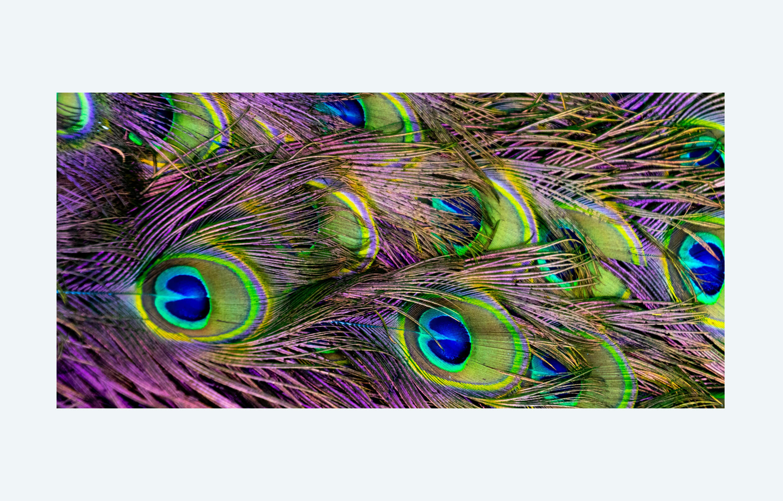
Look at these twenty shades of green, and above them, the five bright colors in a peacock's tail, and you will understand how beautiful the world is. How did you mix your palette, Lord God? Didn't you read about color theory? Haven't you heard that neon green and neon purple shouldn't be combined?

This doesn't mean that in design you can use any colors any way you want without any understanding. But behind the theory of color are centuries of study, and ultimately everything still depends on the eye and feeling. There are no "incompatible colors.” There is only incompetent handling of color in the wrong context.
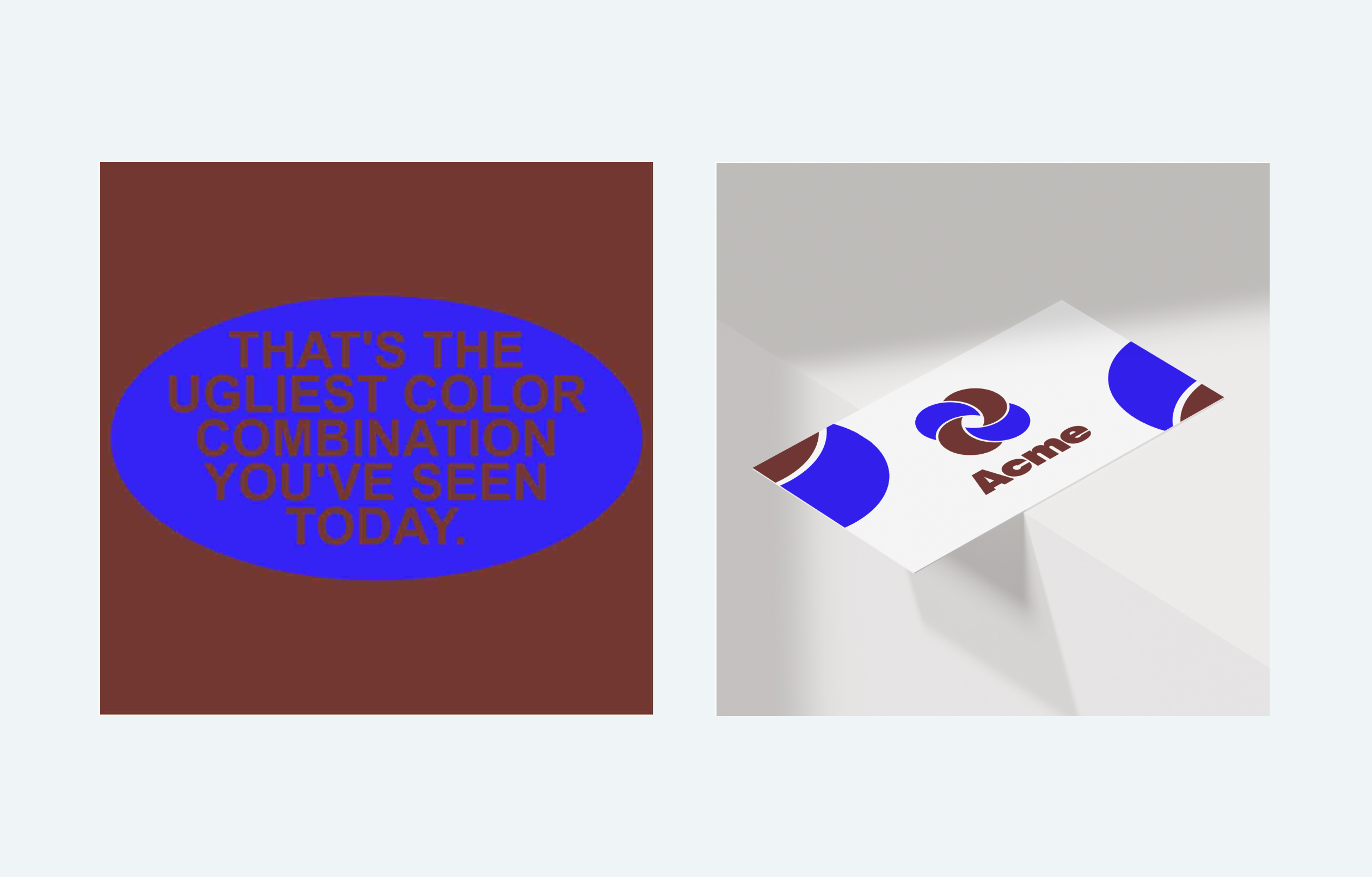
I saw this meme the other day about the ugliest color combination (picture on the left). Immediately I created a logo in which these same colors look quite acceptable (picture on the right).

So what's really wrong with the picture on the left? It was mishandled. It made an ugly composition. It had unreadable typography. It had a poor-quality JPG. And thus, the color combination turned ugly. In my example, the exact same color combination works quite well.
If I haven't convinced you yet, tell me, which color harmony is used in the Shell logo or in this gorgeous tulip, for example? Neither complimentary, nor monochromatic, nor analogues nor split complimentary, nor triadic, nor tetradic harmony works here. Although it is obvious that it is harmonious and beautiful.


